2 Analysis phase
This portion of the manual offers practical guidance and warns against common pitfalls that may be encountered from the point of data generation to the point of data analysis. This collection does not aim to be exhaustive, but rather offer a collection of major pain points that we have encountered in the process of scientific research and an account of how we, and many others, have gone about solving them. The scientific field is enormous and ever changing, for which reason we do not expect our guidance to perfectly apply across all fields, or any field for that matter. However, we do hope that, even if much of this does not apply to you, that it will inspire you and give you a sense of how to go about practicing transparent, rigorous and reproducible science within your own field in your own way.
2.1 Start here
“If you have built castles in the air, your work need not be lost; that is where they should be. Now put the foundations under them.”
Henry David Thoreau
Read this manual BEFORE you begin your study. You need to know what data you should be gathering and what analyses you should be reporting before you even begin your study. This is because there are analyses that you should produce before you even begin (e.g. power analysis) and data that you should be gathering from the get go (e.g. confounding variables used by other teams) that you may not even think of gathering in advance.
Recognize and avoid cognitive biases. It is important to recognize that we are all subject to cognitive biases and take steps to mitigate them before you even begin. Confirmation bias is the tendency to generate, analyze and interpret data designed to confirm rather than challenge your hypotheses. Examples of this in science may include running experiments that you know are more likely to confirm rather than dispute your hypotheses, or avoiding tests that may cast a doubt on the robustness of your findings. Try out this fun problem by New York Times for a demonstration of confirmation bias. Overconfidence bias is the tendency to place more confidence in your judgment or ability than is due. Examples of this in science may include attribution of failed replications to someone else’s inferior skill or attribution of unexpectedly positive results to your superior skill. Try out this fun test of your ability to assess subjective probability (overconfidence bias arises from a miscalibration of subjective probability). There are many other relevant biases, such as availability bias, anchoring bias or affinity bias. Think what steps you can take to mitigate the impact of these biases before you begin. Some of the strategies detailed in this chapter (e.g. creating a protocol) represent our approach to do just that.
Pro tip: We often find ourselves being overconfident in our analyses and not running that extra “pointless” check or test. We must say that we have never, ever, ran that extra test without obtaining insightful results that more often than not challenge the confidence we had initially placed in our analyses.
2.2 Statistical Analysis Plan (SAP)
“To consult the statistician after an experiment is finished is often merely to ask him to conduct a post mortem examination. He can perhaps say what the experiment died of.”
Ronald Fisher
Collaborate with a statistician. Yes, the time to speak with a statistician is BEFORE you even begin your study, not after! You can request free statistical consulting at Stanford here, no matter what research you do. By collaborating with a statistician, you are not only improving the quality of your analyses, but you are also learning from the experts. Collaborating with a statistician is a strength, not a weakness.
Find the most appropriate reporting guidelines. These phenomenally useful guidelines indicate how authors should go about reporting their study appropriately. Different disciplines maintain different guidelines for different study designs, most of which can be found at the EQUATOR Network. For example, guidelines exist on how to report randomized clinical trials, observational studies, study protocols, animal pre-clinical studies, lab-based experimental studies, machine learning predictive models, and many more.
Pro tip: There may not be a reporting guideline that fits your needs. We find it helpful to just go through relevant guidelines, extract what elements apply to our studies and use them as a quasi-guideline.
Convert the identified guidelines into your first draft. Take the appropriate reporting guidelines and turn them into subheadings. Then, fill in the blanks to the best of your ability. Do not start your study unless you have completed everything that you could possibly complete a priori. Congratulations, you did not only just create a rudimentary protocol, but in fact you just created your first draft! Yes, the first draft arrived before you even began your study, at zero extra effort. And yes, you write and publish a paper, whether the results support your hypotheses or not.
Pro tip: As soon as you publish a couple of times using your preferred reporting guidelines, you can save time by simply using previous papers as the foundation for your next paper.
Pro tip: Do not worry if your methods are too long. This is the 21st century, not the 1950s - should your eventual paper be too long, simply shift the more detailed version of your work to the supplement (see more details about this below). Having said that, there is much merit in being concise and little merit in dumping an enormous amount of barely meaningful information in the supplement.
Cite the guidelines you have chosen. Cite the reporting guidelines that you are using (e.g. at the very top of your methods section). By doing so, you are spreading the word, acknowledging those that spent time producing these guidelines, boosting the perceived reliability of your own study and helping meta-researchers interested in studying the use of such guidelines.
Clarify a priori versus post hoc decisions. As mentioned in the first part of this manual, it is extremely important to distinguish between confirmatory (a priori) versus exploratory (post hoc) analyses. The former are independent of the data at hand, whereas the latter are dependent and decided upon after the data at hand were seen. Often in today’s literature, exploratory studies masquerade as confirmatory studies, because of incentives, such as being published in more prestigious journals. This is often referred to as HARKing (Hypothesizing After the Results are Known) and it refers to studies where an exploratory analysis led to a specific hypothesis, which is then studied as if the authors intended to study this hypothesis all along. This is problematic because the hypothesis is highly dependent on the particular sample (had we used a different sample this hypothesis may not have been deemed relevant) and it conveys a misleading level of confidence to readers. The beauty of having already created a protocol as your first draft is that you have already clarified which analyses were decided upon a priori - you can then go back and add any future data-dependent analyses to this draft by indicating that the following decisions were taken post hoc.
Pro tip: There is NOTHING wrong with clearly reporting that your study is an exploratory analysis - in fact, doing so would afford a freedom and peace of mind to approach your data however you want, rather than being stranded in the no man’s land of trying to use your exploratory analysis but also constrain yourself to comply with the requirements of a confirmatory analysis, doing neither of the two well in the end.
Create a Statistical Analysis Plan (SAP). Even though not always necessary or universally recommended, you can take your aforementioned protocol up a notch by creating a SAP (all before you collect your data). This is a more detailed account of your statistical approach, even though a well-created protocol should have already mentioned most of what a SAP may include. Two excellent guides on how to construct a SAP can be found here and here.
Pro tip: Creating a SAP may look daunting at first, but you really only have to work through the process once. After that, as mentioned above, you can simply model future SAPs onto what you did before.
Pro tip: As indicated above, should you decide to create a more detailed SAP, do not deviate from the format of your eventual paper - you do not want to be duplicating any work. If by being rigorous and transparent you are spending more time on a project than you did before, you are probably doing something wrong.
Register your protocol/SAP. Optionally, you can submit your protocol for registration at repositories, such as ClinicalTrials.gov and Open Science Framework (OSF). Registration will: (a) hold you accountable to your a priori decisions (we are all human, the drive to change a priori decisions can be substantial and having the registration anchor can be a useful cognitive lifeboat), (b) inform researchers working in the same field about studies underway (if afraid of scooping, you can often request an embargo period) and (c) assist meta-researchers interested in studying how many studies are done and which of those studies are published.
Publish your protocol. Optionally, you can do one of two things: (a) you can have your paper accepted on the basis of its protocol alone and before the results are known (this is known as a registered report) or (b) publish it as a standalone protocol, if the protocol itself represents substantial work (this is often done in medicine for large clinical trials or prospective cohort studies).
Pro tip: We always begin our write up before we even start working on a study. We take the appropriate reporting guideline, convert it into subheadings and then fill in the blanks. We fill in whatever is not data-dependent before the study (which is the majority of subheadings) and whatever is data-dependent after the study. Any data-dependent changes we clearly indicate as “post hoc.”
2.3 Data generation
“No amount of experimentation can prove me right; a single experiment can prove me wrong.”
Albert Einstein
If possible, run a pilot. It is very common to realize shortcomings in your protocol as soon as you start gathering data. A small pilot study is often a great way to avoid changing your protocol after study initiation and pretending that this was the protocol all along. If you do absolutely need to change your protocol, indicate what changes were made post hoc because such decisions are likely data-dependent. Again, there is nothing wrong in being clear about post hoc decisions and nothing wrong about reporting failed experiments; however, much is wrong with not reporting data-dependent changes or initial failed experiments and these may even amount to scientific misconduct.
Pro tip: Pilots can be very helpful in imaging studies, where saturated pixels may take you outside of your instrument’s linear range and complicate your analyses - use pilot studies to identify the desired antibody dilutions.
DO NOT pick and choose. It is often convenient, and very tempting, to pick and choose data points that promote your point of view, but do not necessarily accurately reflect the whole. For example, in microscopy you may image a field of view that clearly illustrates the effect of interest to you, whether or not this is a representative sample of the whole picture. Similarly, in clinical trials you might not enroll patients that you think are less likely to respond, or overzealously enroll patients that you think are likely to respond. This practice may wrongly inflate the effect you are trying to quantify and wrongly deflate the observed uncertainty. In clinical trials this is mitigated by blinding (the doctor and patient do not know whether they are on treatment or placebo) and allocation concealment (the doctor does not know whether they are about to allocate the patient to treatment or placebo). In microscopy, this can be mitigated by only imaging at a number of predefined XY coordinates. Feel free to come up with methods that suit your needs, using the guiding principles of being systematic, honest and not fooling yourself or others.
There is nothing magical about repeats of three. This is particularly relevant to biologists, who seem to like repeating experiments three times, or even four times if they want to feel extra rigorous (or, if the first three did not reach statistical significance, God forbid). First, always decide how many times you would like to repeat BEFORE you begin your experiments. If you have already begun, then it is too late - deciding how many times to repeat an experiment on the basis of the p-value is extremely problematic. If you cannot resist the temptation of chasing the p-value, (a) clearly mention in your manuscript that you decided to add an extra repeat to achieve significance and (b) speak with a statistician to help you analyze your data (it is possible to account for chasing the p-value in your statistical analysis and still arrive to a correct p-value). Second, use a power analysis to decide how many repeats you need. The rule of thumb in clinical research is to go for 80% power (i.e. have an 80% probability of a sufficiently low p-value when the null hypothesis is false). If you do not know how to do a power analysis, (a) speak with a statistician, (b) most statistical packages can do this for you (see here for GraphPad Prism; see here for R).
Pro tip: Yes, doing a power analysis for the first time will be time-consuming and will feel daunting and pointless. However, after a few times, you will become a pro.
Pre-determine your sample size or repetitions. Known as stopping time, this is the time you stop data generation. This time may be the number of participants you decide to recruit, the number of experiment repetitions you decide to run or the number of simulations you decide to run. Not abiding to such a stopping rule is sometimes referred to as sampling to a foregone conclusion and it is a bulletproof method to get as small a p-value as you like. However, this p-value is at best meaningless and at worst deceitful. As indicated above, always decide your stopping time BEFORE you begin your study. If you do want to proceed until you get a low enough p-value, this is possible, but you will need to analyze your data differently - if you do not know how to do that, speak with a statistician.
Use a specific seed when simulating data. If your data generation involves data simulation, always use a seed (e.g. in R do “set.seed(123)”), otherwise your procedure will not be reproducible (because every time you run the code you will get a different set of random numbers). Note that random numbers may appear in algorithms that you did not even expect. Also note that if you are using parallel processing you will need to set the seed in each of the cores you are using, which is not always straightforward and may require a bit of digging to find out how to do it if you have never done it. Testing your code on multiple systems and verifying that you can reproduce the same results (even on simulated data), is a good way to help ensure that you have set the seed correctly.
Update your draft. It is almost impossible to have generated your data without encountering something that you did not foresee. If you did, now is the time to mention this in your draft and make any other necessary changes. Clearly indicate that these changes were made after observing the data.
2.4 Data preparation
Create an analytic dataset. Keep the data obtained from your data generation process as your “raw dataset.” Import your raw dataset into your program of preference to prepare your data for analysis - this new dataset will be your “analytic dataset.” This involves steps such as data validation (make sure that all of your data make sense, e.g. nobody is more than 150 years old!), data standardization (e.g. someone may have reported they are from the USA whereas someone else may have reported they are from the United States - these two need to be standardized according to your preferences) and dealing with missing data (see below). NEVER MODIFY YOUR RAW DATA, however easy it may be to reobtain. Keep the code required to create the analytic dataset separate from the code used for data analysis - this modular approach to data creation leads to much tidier code and allows you to easily recreate your analytic dataset whenever you realize that something was missing.
Pro tip: Name your analytic dataset after your code file - this way anyone can easily tell which file created each analytic dataset.
Pro tip: Have a look at the Publication phase for more details on how to organize your files on your computer appropriately.
The DOs of analytic datasets. Things you should always do:
Make sure that there is a column or field that uniquely identifies each observation. This column is often called an “ID” column. Duplicates almost always creep in.
Make sure that each column has a unique name, i.e. no two columns have the same name. This is because some programming languages cannot handle datasets with non-unique column names and we want our dataset to be easily used by everyone no matter software.
Make sure that column names do not include any spaces, line breaks or punctuation other than “_”. This is for the same reason as above.
Give expressive but concise names to columns. If in doubt, always go for “too long” a name than “too short”. Ideally, even though not always possible, others should be able to tell what the column means just by reading the column name and without reading the data dictionary.
Make sure that you save your analytic dataset in a format that anyone can access (e.g. CSV, JSON, XML). Do not save as .xlsx because not everyone uses Microsoft Excel.
The DONTs of analytic datasets. Things you should never do:
Never remove outliers at this stage. If you do want to remove outliers, which is rarely recommended, only do this while analyzing the data.
Never convert continuous variables into categorical variables (e.g. do not replace ages above 80 with ≥80 years old and ages below 80 with <80 years old) because you are losing information. This is an analytic choice that should be taken into account later on while analyzing your data.
Never edit data by hand in Excel as it is impossible for others to replicate this process (if you really want to do so, even though you should not, create a detailed guide of what steps someone should follow to convert the raw data into your analytic data in Excel). Also be careful when it comes to dates and times, as these are sometimes handled differently by different systems. As a safety measure, it may be worth saving the essential components of the data in separate columns (e.g., adding additional columns for year, month, and day, if that is the level of granularity at which the data were acquired).
Pro tip: A good convention is to keep column names lower-case and separate words by “_” (e.g. medical_history). You can also use the following prefixes to name columns in ways that reflect their data type: (a) “is_” denotes a binary variable with entries as Yes/No or TRUE/FALSE (e.g. “is_old” could denote patients older than 80 years), (b) “num_” denotes a continuous variable (e.g. “num_age” could denote the age) and “n_” denotes counts (e.g. “n_years” could denote number of years). Finally, consider using the unit of measurement within the column name when this is ambiguous; for example, “years_since_onset” is preferable to “time_since_onset” because the former clarifies that the column is in “years” and obviates confusion or the need to check the data dictionary.
Pro tip: The better the column names, the less often a reader should need to consult the data dictionary. Even though often inevitable, we consider it a failure when someone cannot deduce the contents of a column simply by reading the study and the name of the column.
Dealing with missing data. This is complicated, there is no satisfying answer and many pages have been written about it (probably because there is no satisfying answer). However, there is a very clear answer to what you shouldn’t do, and this is that you should NEVER pretend that there was no missingness! Whether you decide to do something about the missingness or not (e.g. imputation, sensitivity analyses, etc.), ALWAYS indicate how many observations from what variables were missing. In terms of what to do about it, a rough rule of thumb is to leave it as is if < 5% of observations are affected, otherwise use multiple imputation: Figure 1 of this guide is a great summary.
Pro tip: If you decide to impute, always report results from the imputed and the original dataset. Again, there may be a problem in reporting too little, there is rarely a problem with reporting too much.
NEVER throw away data. Do not crop away data from images or Western blots. Do not get rid of observations with inconvenient measurements. These are analytic choices that should be taken during data analysis - see further details in Data analysis.
Update your draft. It is almost impossible to have not encountered something that you did not foresee. If you did, now is the time to mention this in your draft and make any other necessary changes. Clearly indicate that these changes were made after observing the data.
2.5 Data visualization
“The greatest value of a picture is when it forces us to notice what we never expected to see.”
John Tukey
Always visualize your data. Countless errors have been caught by this simple step, to visualize your data using a simple histogram, box plot and scatter plot (the figure below is known as Anscombe’s quartet and shows four scatter plots of very different distributions but identical correlation). In R, you can do this for the whole dataset using a single command (“ggally::ggpairs” - note that if using this command, you may want to prioritize visualizing the top 10-15 most interesting variables for clarity). You can upload these visualizations as a supplement to offer a feel of your data to readers with no access to your data.
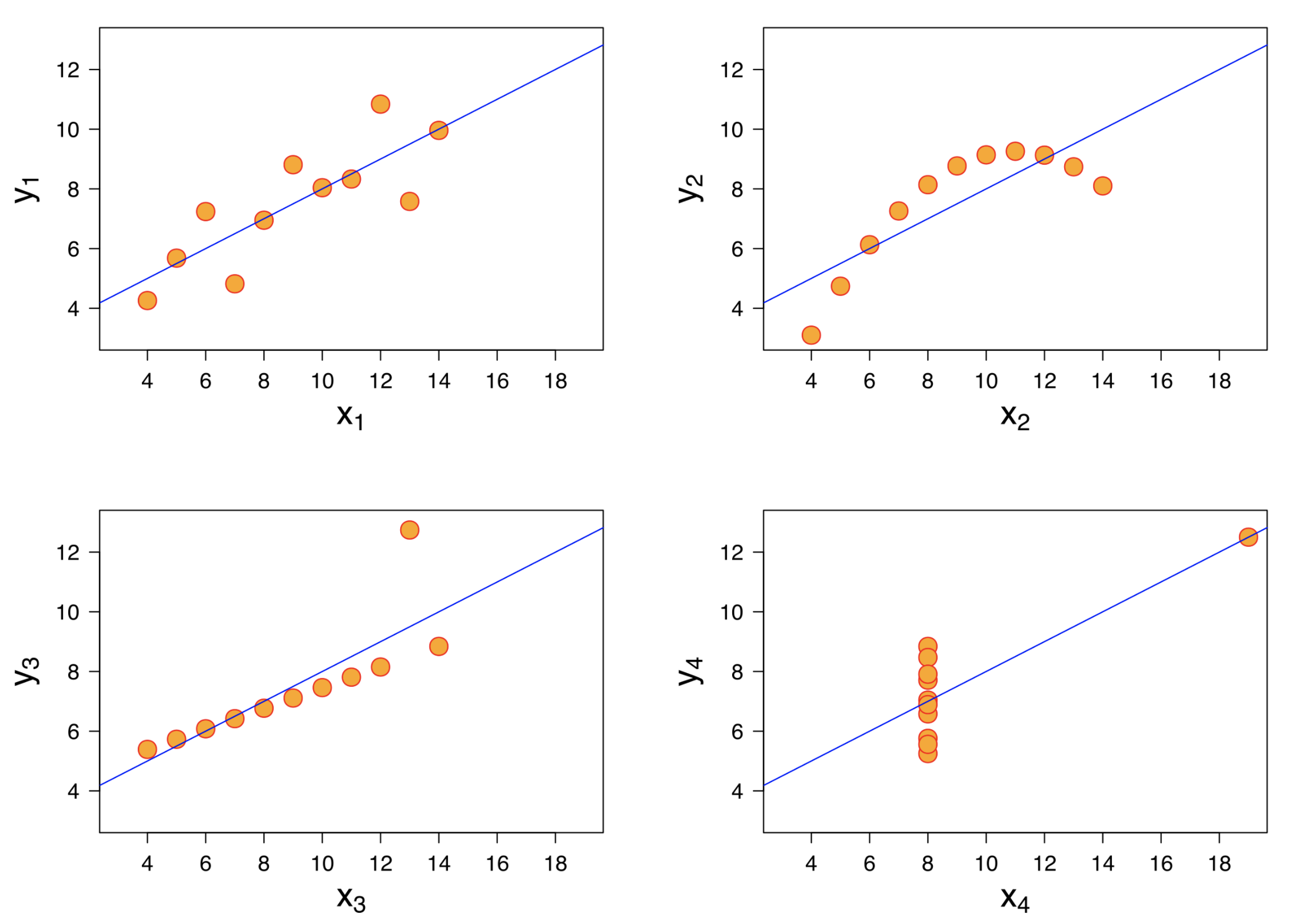
(#fig:anscombe_quartet)Figure credit: https://en.wikipedia.org/wiki/Anscombe%27s_quartet
If you are plotting a bar chart, you are probably doing something wrong. It is a very common practice in biology to take a few points, such as 3 means each from a different experiment, and plot a bar chart of their mean. This is very misleading because it conceals the uncertainty in each of the means. So what should you do? If you have summary statistics (e.g. means) from repeat experiments, plot them with standard error bars - this is nicely done in R by using dot-whisker plots. If you have many data points (e.g. age of participants), DO NOT create a bar chart of their mean or any other statistic - create a boxplot.
Never use a pie chart. Thankfully, this was answered for us by the father of data science himself, John Tukey: “There is no data that can be displayed in a pie chart, that cannot be displayed BETTER in some other type of chart.”
Plot the individual data. Try to, as far as possible, plot all individual data points. For example, if you are plotting a boxplot, also include the individual data points (e.g. by using ggplot2:geom_jitter or ggplot2::geom_dotplot). If you are plotting a regression line, do not just plot the line of best fit, also include a scatterplot of your individual data.
Pro tip: Remember what we said earlier about random numbers creeping up on you? If using geom_jitter in R (which you should), you need to use a seed to create a reproducible plot. To do so, define the position argument of the command like so: geom_jitter(position = position_jitter(seed = 123)).
Update your draft. You now have your first results. Use the reporting guideline you had chosen above for guidance on how to report your results. Be concise, but at the same time transparent, comprehensive and honest. By writing all of your thoughts while analyzing your data and presenting your analyses (e.g. in lab meetings) you are maximizing your efficiency as you will not have to repeat the same work when you are done. Remember to clearly indicate any changes to your initial plan and clearly indicate that these were made after observing the data.
2.6 Data summarization
“The first principle is not to fool yourself, and you are the easiest person to fool.”
Richard Feynman
Produce summary statistics for all of your data. Always summarize your data for the reader (e.g. produce means, standard deviation, medians, interquartile ranges, etc.). This is standard in some fields (e.g. medicine), but not others (e.g. computer science). Even in fields in which it is standard, most will only produce summary statistics of just a few variables. However, in R, with a single line of code you can summarize all of your data using the packages skimr or summarytools (preferred) - both even produce a histogram for each variable as well. You can then submit the output of the summarytools package as a separate file to be published alongside your article. We cannot stress enough that nowadays, using computers, ANY form of data output can be made available and we should apply no restrictions, given how easy it is to produce such summaries.
You should probably be using the median, not the mean. In summarizing skewed variables, the median and interquartile range are usually more meaningful than the mean and standard deviation. However, again, you should not feel that you need to prioritize and should you want, you can report both (e.g. report the median in the main table of your text and report the median and mean in the automatically created summary tables included in your supplement).
Update your draft. As above, no need to wait until the end, be efficient and clearly indicate any post hoc decisions as such.
2.7 Data analysis
“All models are wrong, but some are useful.”
George Box
Decide whether you plan to describe, predict or estimate. This is arguably the most important data analytic decision you need to make, it should be made at the outset and it should be clearly communicated. Miguel Hernan and colleagues recently proposed that most analytic tasks can be classified into description, prediction or counterfactual prediction (or, estimation). Description is “using data to provide a quantitative summary of certain features of the world. Descriptive tasks include, for example, computing the proportion of individuals with diabetes in a large healthcare database and representing social networks in a community.” “Prediction is using data to map some features of the world (the inputs) to other features of the world (the outputs). Prediction often starts with simple tasks (quantifying the association between albumin levels at admission and death within one week among patients in the intensive care unit) and then progresses to more complex ones (using hundreds of variables measured at admission to predict which patients are more likely to die within one week).” “Counterfactual prediction is using data to predict certain features of the world as if the world had been different, which is required in causal inference applications. An example of causal inference is the estimation of the mortality rate that would have been observed if all individuals in a study population had received screening for colorectal cancer vs. if they had not received screening.” This distinction is very important because these three tasks require fundamentally different approaches, even if you are using the same statistical machinery. For example, when using linear regression, in description you would be interested in fitting to the data at hand, in prediction you are interested in fitting to future unobserved data and in counterfactual prediction you are estimated in fitting to an unobserved world. In biology, most labs are interested in counterfactual prediction (where the control is the counterfactual). In medicine, most teams are also interested in counterfactual prediction, but in fact are publishing descriptions or predictions.
Test and report ALL possible analytic choices, not just your favorite. Named as “The Garden of Forking Paths” by the famous statistician Andrew Gelman and often referred to as “researcher degrees of freedom”, this is the practice of reporting the results of a very specific set of analytic choices, where many other legitimate choices exist and where, had the data been different, different choices would have been made. A fantastic study by Botvinik-Nezer et al. (2020), assigned identical data to 70 independent teams and tasked them to come up with p-values for 9 different hypotheses - they identified high levels of disagreement across teams for most hypotheses and that for every hypothesis there were at least four legitimate analytic pipelines that could produce a sufficiently low p-value. Gelman suggests that these problems could be solved by: (a) pre-registering intended analyses before any data is obtained and (b) following up the results of a non-preregistered exploratory analysis by a pre-registered confirmatory analysis. Other approaches are: (a) define all possible analytic choices and have them all run automatically, (b) have the same data analyzed by a few separate teams (this is widely practiced in genomics) or (c) define all analytic choices and the conditions that would lead to each choice and then bootstrap the whole analytic path, not just the final analysis. For an example of the last approach, say out of 1000 observations you identify a few outliers that you would like to remove - do not simply remove those points and rerun your analyses; instead, run a bootstrap where points beyond a predetermined threshold are removed - this is the correct p-value that should be reported.
Pro tip: All approaches to solving the problem of forking paths are excellent, but the simplest is to just report everything you did. If you fitted multiple models and one of those works best, do not just report the one model, report all models, compare and contrast them. If you are deciding between fitting a few models, fit all of them, compare and contrast them.
Incorporate analyses done by others, do not just analyze your data your way. Even though it is common practice in some disciplines to incorporate analyses from previous papers, such as comparing the performance of your new machine learning method with previous methods on the same data, in other disciplines it is not. In fact, in medicine, different groups tend to analyze different data differently, such that no two groups ever create similar results and no two studies can be reliably combined into useful knowledge despite working on the same question for more than half a century (Serghiou et al., 2016). For example, if a previous study analyzed their data using propensity matching and you want to use an instrumental variable in your data, do both. If a previous group included smoking as a confounder in their model, but you do not think this is a confounder, fit two models, one with smoking, one without. If you are developing a new prediction model, compare its performance to prediction models developed previously within the same data. If you are trying to extend the work of another lab, which often implies that you need to develop their own approach and replicate some of their experiments, do not just report the new experiments, report the whole process - this will help us understand how effect sizes vary across labs and in combination with estimates from previous labs we will have a better estimate of the true underlying effect.
Pro tip: Wet labs often do not produce exact replications of previous work. They deem those rather boring and time-consuming, for which reason they usually produce conceptual replications, i.e. use different often less involved methods to test the same hypothesis. This is often problematic because it is impossible to interpret the findings of these experiments without reproducing the previous experiments. Did your findings support previous findings for the same reason? Did your findings not support the previous findings because the published experiments were in fact an artefact or for some other reason? These problems mean that these half-hearted replication approaches often end up on the shelf, never published and as such in the end take up more time than the exact replications. As such, try to engage in exact replications, do those well and with a registered plan and publish your results - many journals, such as eLife, accept replications.
Control for multiple testing. You may be surprised to know that out of 10 clinical trials of ineffective drugs, the chance of getting at least one p-value < 0.05 is 40%! So what should you do if your work involves calculating multiple p-values? First, as a rule of thumb, if you are running more than ~10 statistical tests, you need to use a procedure to control the false discovery rate (i.e. the probability of obtaining false positive p-values). We recommend using the Benjamini-Yekutieli procedure, which is better than the Bonferroni correction (assumes independence) and cleverer than the Benjamini-Hochberg. You do not need to know much about this, other than most statistical programs can do it automatically for you (see here for R; see here for GraphPad Prism). Second, if you are comparing between more than two conditions (e.g. outcome with drug A, B, C or D), first test for the presence of a difference between at least two conditions (e.g. using the one-way ANOVA to test for a difference in means). A positive test suggests that there is a difference between at least two conditions. If a difference is found and you would like to know where the differences lie, you need to use a post hoc test. The most commonly used post hoc test for one-way ANOVA is Tukey’s honest significant difference method (see here for R; see here for GraphPad Prism) - using a specialized post hoc procedure is important to maintain the desired false discovery rate.
Pro tip: It can often be tricky to know whether you should control for the FDR or not. Even though this sounds like you should be talking with a statistician, briefly, we use two rules of thumb: (1) count the number of p-values that could constitute a “finding” within each one of your objectives (e.g. if your objective is to find which one of 20 characteristics may cause cancer, then a low p-value in either one of those 20 would constitute a “finding”, so your count is 20); (2) individually control the FDR for any objective where >10 p-values could constitute a finding.
Compare effect sizes, not p-values. Comparisons of p-values are meaningless. For example, you cannot say that there was a statistically significant improvement in the group taking the new drug (e.g. p-value = 0.003), no statistically significant improvement in the placebo group (e.g. p-value = 0.3), hence the drug is effective! You have to statistically test the change in the new drug group against the change in the placebo group.
Pro tip: This is a fantastically common problem. Articles often do not actually test the hypothesis of interest. Instead, they test many other hypotheses and then verbally combine the results of those hypotheses to claim significance in the hypothesis of interest.
Never combine means - or any other statistic - as if they were data points. It is very common practice in biology to take means from separate experiments (e.g. prevalence of a marker in different Petri dishes) and then taking the mean of means as if they were data points. Some may frown upon reading this and suggest that no, you should add the raw data from all experiments and take the mean of that. The bad news is that, neither of the two is correct. The first method falsely disregards the uncertainty in each estimate of the mean and the second approach falsely disregards the uncertainty within and between experimental conditions. So what should we do? Use a meta-analysis: this is far easier than it sounds and the gist of it is to take the weighted mean of your means, where each mean is weighted by its variance. This is known as the Mantel-Haenszel method - you can read more about it and implement it in R with one line of code as per here.
Pro tip: We are so frustrated by this problem that we vouch to pay $50 to the first biologist that sends us an email of a manuscript they have just published where all statistics were combined using a meta-analysis.
Be cautious when converting continuous data into categorical data. Say you have patients of ages from 25-80 years old and those greater than 65 years old constitute the oldest 10% of your data. A possible analytic decision is to consider everyone >65 years as old and every below as not old. This is fine, BUT, you need to include this analytic decision within your calculation of uncertainty. As we argued above, if you had taken a different sample, the top 10% oldest could have been 50 or 70 years old. You can do so by discretizing your data (i.e. turning them into categories) automatically WITHIN each bootstrap, not before.
Set a seed. If your analysis involves any random components (e.g. in a simulation, hyperparameter tuning, parameter initialization, etc.) then make sure that you set the seed to make your work reproducible. For more, see a similar point made in “Data generation”.
Collaborate with a statistician. As indicated above, there is no need to do your own statistical analyses and, in fact, there are a lot of upsides to requesting external help. You can request free statistical consulting at Stanford from here. By collaborating with a statistician, you are not only improving the quality of your analyses, but you are also learning.
Update your draft. As above, no need to wait until the end, be efficient and clearly indicate any post hoc decisions as such.
2.8 Data analysis - medicine
If you can avoid reporting odds ratios (and most likely you can), avoid it. Many report odds ratios when they do a logistic regression. However, very few realize that odds ratios inflate the perceived result (i.e. the odds ratio is always more extreme than the risk ratio, unless it is 1, in which case they are identical) and can change in an exponential fashion. In fact, many are not aware of the difference between odds and risk (i.e. chance) and commonly interpret odds as if they are risks. So what should you do? Convert it to a risk ratio! An example can be found here.
If you can report the number needed to treat (and most likely you can), report it. In clinical medical research, it is very common to report odds ratios or risk ratios, but very rare to report the number needed to treat (NNT). The problem is that, in fact, the most relevant metric of them all, in terms of policy making, is the NNT. Always make this number available.
2.9 Statistical analysis report
“We have the duty of formulating, of summarizing, and of communicating our conclusion, in intelligible form, in recognition of the right of other free minds to utilize them in making their own decisions.”
Ronald Fisher
Report EVERYTHING - leave no man behind! Good reporting is not only about how to report, but also what you choose to report. And the answer to what you should report is always EVERYTHING! Up to say 30 years ago, it could make sense to select what you choose to report because scientific communication occurred predominantly via limited printed text. This is not necessary anymore. You can include Supplementary Information of as many pages as you want, submit to journals with no word limits (e.g. PLOS Biology) or submit to journals that do not prioritize novel findings (e.g. eLife, PLOS One). You can even avoid the peer-reviewed literature altogether and submit as a preprint (e.g. bioRxiv) or simply as a Medium article. If an experiment is not worth reporting it should not have been done in the first place - if it was worth even contemplating doing, it is worth being reported. Not reporting it is either a form of data dredging, misuse of taxpayer money, or both. Imagine the poor PhD student spending months of their time and taxpayer money working on an experiment that you could have already told them is a dead end.
Pro tip: We have never regretted reporting too much, but we have regretted having reported too little.
Pro tip: As a peer reviewer, we have been asked to review articles where authors did report everything, but their method of reporting everything was to simply dump all of their analyses into a massive supplementary file of hundreds of pages. This too is bad practice, as being open is not always equivalent to being transparent. If the information you are providing is difficult to get through that can be a barrier to transparency. Consult the Basu et al. (2020) paper from the Examples to see how they seamlessly included all analyses into their article.
Pro tip: If you are in biology, please stop making your best picture available in your papers. Instead, show a picture where the effect is very clear and contrast it with a picture in which the effect is very unclear. Additionally, make ALL pictures available on an online platform (see Data sharing for more details). As above, we pledge $50 to the first person to send us a newly published paper in which they have abided by these principles.
Never choose what to report on the basis of the p-value you p-hacker. Known as data dredging, data fishing, data snooping or p-hacking, this is the practice of engineering more confidence in the reported p-value than it is due. Say for example you do an experiment 20 times, you get 19 p-values above 0.05 and one below 0.05. Simply reporting the one “successful” experiment and not reporting the 19 “unsuccessful” experiments is a form of p-hacking because you are falsely inflating the perceived chance that your result is a true positive - had we known that this was only 1/20 experiments, we would likely consider this is a false discovery (i.e. a false positive). Here is a fantastic article by FiveThirtyEight should you want to test your ability in engineering a low p-value. The p-value should never determine whether a result is reported or not. And here is a website to caution you against spurious associations - just because they are correlated, it does not mean that they are causally related.
Pro tip: We avoid p-hacking by using a trick suggested by Tukey. We always develop our analytic plan using a massively subsampled version of our data, say using 100 out of 5000 observations. By subsampling our data to the extent that getting a low p-value is almost impossible, we avoid making decisions on the basis of the p-value. When all of our analyses are done, we then switch to using all of our observations, to obtain the results that we will report in the study. Another version of this is known as “honest estimation”: you split your sample in two, develop your model in the first half (i.e. decide what variables to include) and fit it in the second half - to avoid throwing away data, you can do it again in the opposite direction (develop in the second half and fit in the first half) and take the mean of the two models.

Figure 2.1: Figure credit: https://en.wikipedia.org/wiki/Anscombe%27s_quartet
Report the effect sizes, do not just report p-values. For some reason, we have grown to love the p-values, and grown to disregard the actual effect size. For example, most biologists would be far more interested in whether a correlation is “statistically significant” vs. what the magnitude of that correlation actually was. This is very sad because a correlation coefficient of 0.9 has an enormously different interpretation that a correlation coefficient of 0.1 - in fact, given enough data, any correlation coefficient could be found to be statistically significant. If you were to choose between values to be reported, a rough heuristic would be to first choose the 95% Confidence Interval, then choose the point estimate (e.g. the correlation coefficient) and then choose the p-value. Some researchers have even gone so far as to suggest that p-values should never be reported (Amrhein et al. 2019), which received an equal and opposite response (Ioannidis 2019) - regardless, we are afraid that neither of the two expressed any fondness for the over-reliance on p-values and the under-reporting of effect sizes.
Analyze and report your analyses as if you are contributing evidence towards a research question, not necessarily to conclusively answer it. Your study is not meant to conclusively answer a research question. Most research questions are so broad, results vary so much across different conditions, different populations, different species, different cells, etc., and time and money are so limited that you cannot conclusively answer a research question. Science advances by assessing the totality of evidence arising from several studies, which by synthesis and triangulation can be used to come up with the most likely answer. The reason this is important to realize is that you should view your analyses, experimentation and reporting as primarily offering evidence, that in combination with evidence from other labs can be used to estimate the truth. Do not feel the urge to present the one and only best of the best analysis, because it does not exist. Fight the urge to hide those null analyses that you think may weaken your conclusions. Reveal all of your analyses, all of your experiments and incorporate any uncertainty in your findings.
Publish or perish. Add the Grimes 2018 paper.
2.10 Examples
This is a fantastic example in which all analyses and all findings were reported, not just the one and only that the authors believed was the best. Readers have the right to decide for themselves which analysis to believe in and differences between analyses reveal details about the data that would have otherwise been missed.
This is a fantastic example where the authors used multiple methods to analyze their data and reported all of their analyses. The authors also went at great length in their supplementary materials to explain their analytic approach in detail, often creating accounts of methods that exceed in quality ones you would find in certain statistical textbooks!
This study was available on GitHub from the get-go, such that you could actually see in real time how the project was changing and what new analyses were being added. The GitHub now serves as a great example of how to organize your projects and can be accessed here.
2.11 Resources
2.11.1 General
Best of data science. This is a GitHub repository that one of us (S.S.) maintain and to which he adds his favorite resources related to data science, from books, to packages, to tutorials. The most useful and most actively maintained list is that of R material and you are bound to find most of what you need in order to practice data science in R like a pro (books on R and statistics, guides on data visualization, data summarization, Bayesian statistics, etc.) - if there’s something that you do not find, please raise an issue on the GitHub page! Note that if you are paying money to learn how to code in R and how to practice basic data science you are probably doing something wrong.
MiB Open Science support. A great resource with details about various aspects of the transparent, rigorous and reproducible workflow. It contains a section on creating a statistical analysis plan (even though this may be going over the top).
Researcher Academy. An effort by ELSEVIER to provide free e-learning modules on research preparation, writing for research, the publication process, navigating peer review and communicating your research. Overall, even though it includes useful information, it certainly falls short in describing how to practice more transparent, rigorous and reproducible research.
2.11.2 Statistical analysis plan
EQUATOR Network. A comprehensive searchable database of reporting guidelines and relevant resources. At the time of writing, EQUATOR maintained an index of 432 reporting guidelines!
Principles and Guidelines for Reporting Pre-clinical Research by the NIH. A consensus guideline from editors of 30 basic/preclinical science journals. Even though not as explicit as the ARRIVE guidelines, it certainly mentions all important considerations of transparent and rigorous reporting.
2.11.3 Data visualization
Data visualization guidelines by Google. Google designers came together to construct guidelines for data visualization. The first product of this work is this collection of six principles on how to create meaningful and effective data visualizations.
R Graph Gallery. A website that collects beautiful data visualizations with the code required to reproduce them. Code is available across a number of languages (e.g. R, Python, D3.JS).
Beyond Bar and Line Graphs: Time for a New Data Presentation Paradigm. Are you a bioscientist that would like to produce good visualizations, has heard of the concerns about bar charts, but is unsure how to proceed? This PLOS Biology article is what you need.
2.11.4 Data analysis
Statistical Thinking for the 21st Century. This is a book by our own Russell Poldrack that can be found for free online. It represents an excellent combination of modern statistical thinking, concise text meant for the non-expert and examples using R code.
Regression and other stories. You are just bound to fit at least one regression in your lifetime as a researcher, and most for better or worse, are bound to fit hundreds of regressions. This is a new book fresh off the press and if we had to recommend one approachable book with someone with basic understanding of mathematics to learn from as a practical guide, this would be it. We love that they also make code available and part of the main text.
Statistical Rethinking. If you have been hearing about Bayesian statistics and yearning for a simple guide to teach you the basics and give you ready-made code to plug and play, yearn no more. This is exactly what this book does and it does it really well.
Computer Age Statistical Inference. Are you good with numbers, have a basic understanding of probability and statistics and want to learn how to shift towards incorporating more modern methods, such as the bootstrap? Search no more, this book by Stanford faculty does this better than anyone and it is available for free online.
Introduction to statistical learning. Do you already have a basic understanding of probability and statistics and want a good book on how to start using methods of machine learning? This book by Stanford faculty is the best on the subject that we have encountered and one that we find ourselves returning to time after time.
What is a p-value anyway? 34 Stories to Help You Actually Understand Statistics. Have you heard about how many misinterpret the p-value but do not actually understand the concerns? Then this is the book for you. It is simple, no statistical knowledge is necessary to understand it and it does a fantastic job on explaining the p-value through the mentioned stories (it’s only ~200 pages).
Introduction to Probability. Many complain that even though they have a working knowledge of statistics, they do not have a basic understanding of the underlying machinery. If you would like to read the one book that you will ever need to read about basic probability theory, this is it. It is phenomenally well written, provides the best explanations we have seen, extremely intuitive examples and a plethora of exercises, many with solutions. We have not even encountered a close second to this book.
2.11.5 Statistical analysis report
HealthNewsReview.org. This website rates how well and accurately popular news articles describe the underlying findings. Even though specific to healthcare, this is a fantastic resource about common caveats to improve your critical thinking through. Unfortunately, this website is not as active anymore as it used to be due to funding issues, but all of their excellent work is still available and they do publish new content now and then.
The Art of Statistics: Learning from Data. A fantastic book by arguably the leading communicator of statistics, David Spiegelhalter. As per the Amazon description: “How many trees are there on the planet? Do busier hospitals have higher survival rates? Why do old men have big ears? Spiegelhalter reveals the answers to these and many other questions - questions that can only be addressed using statistical science.”